Description
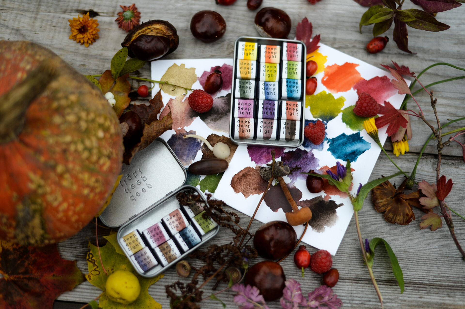
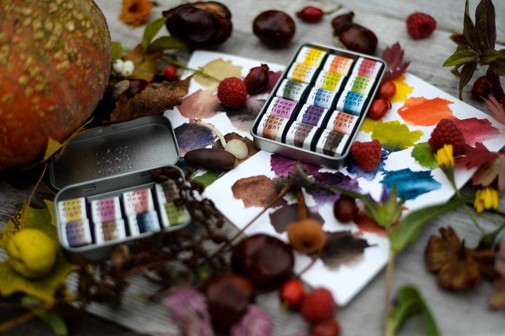
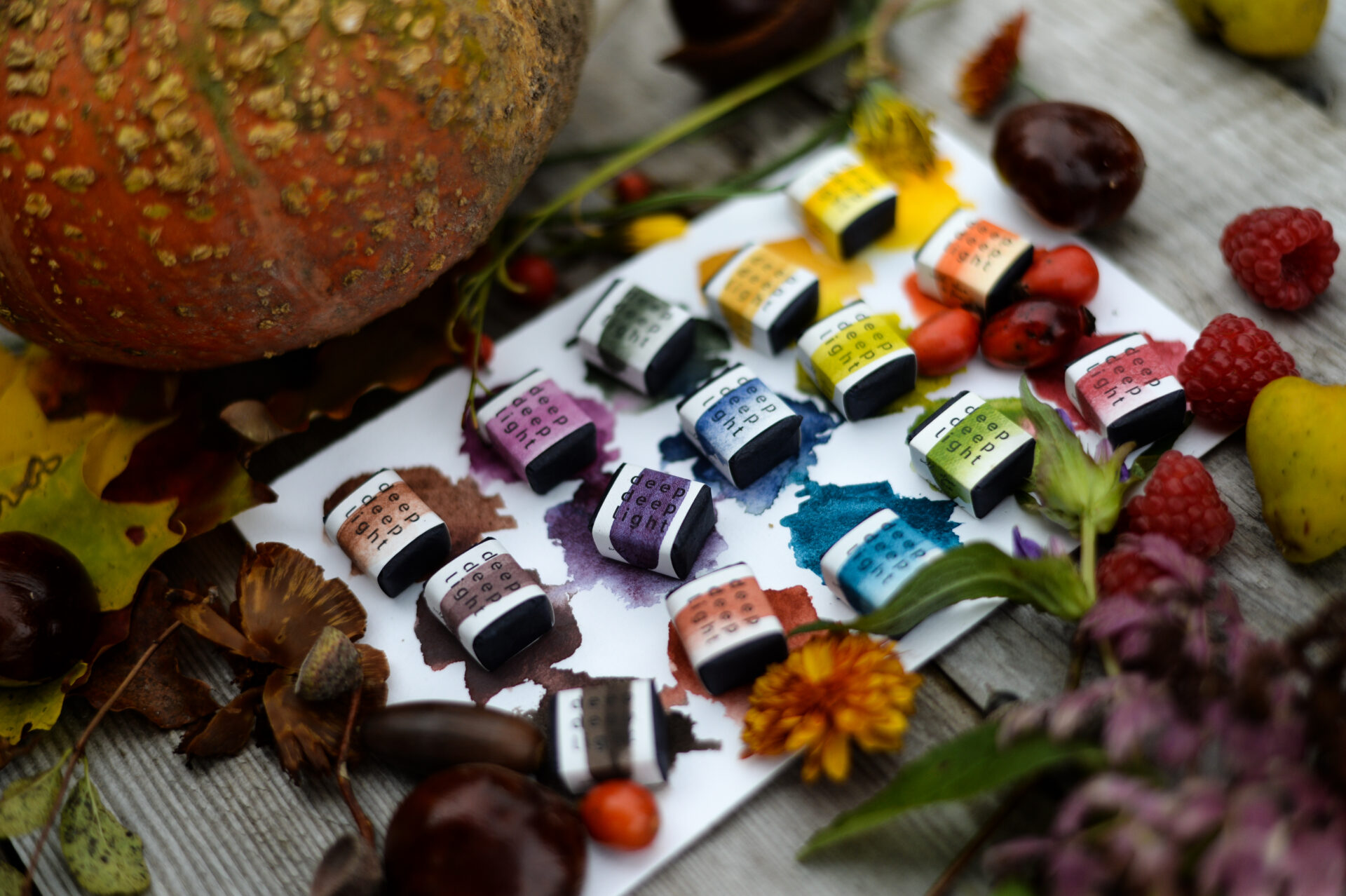
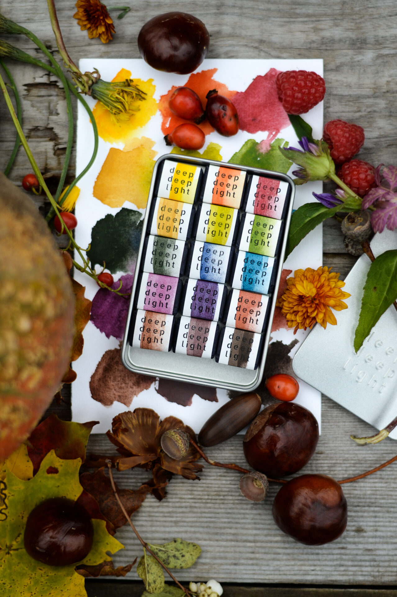
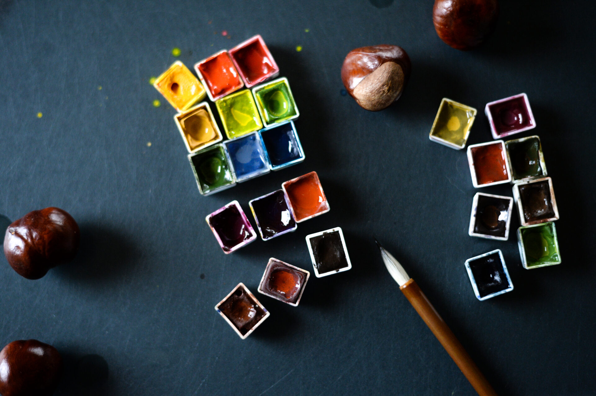
The Big Palette (15 half pans in a tin with a sliding lid):
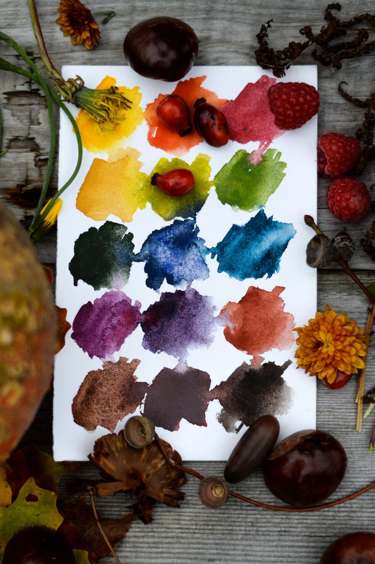
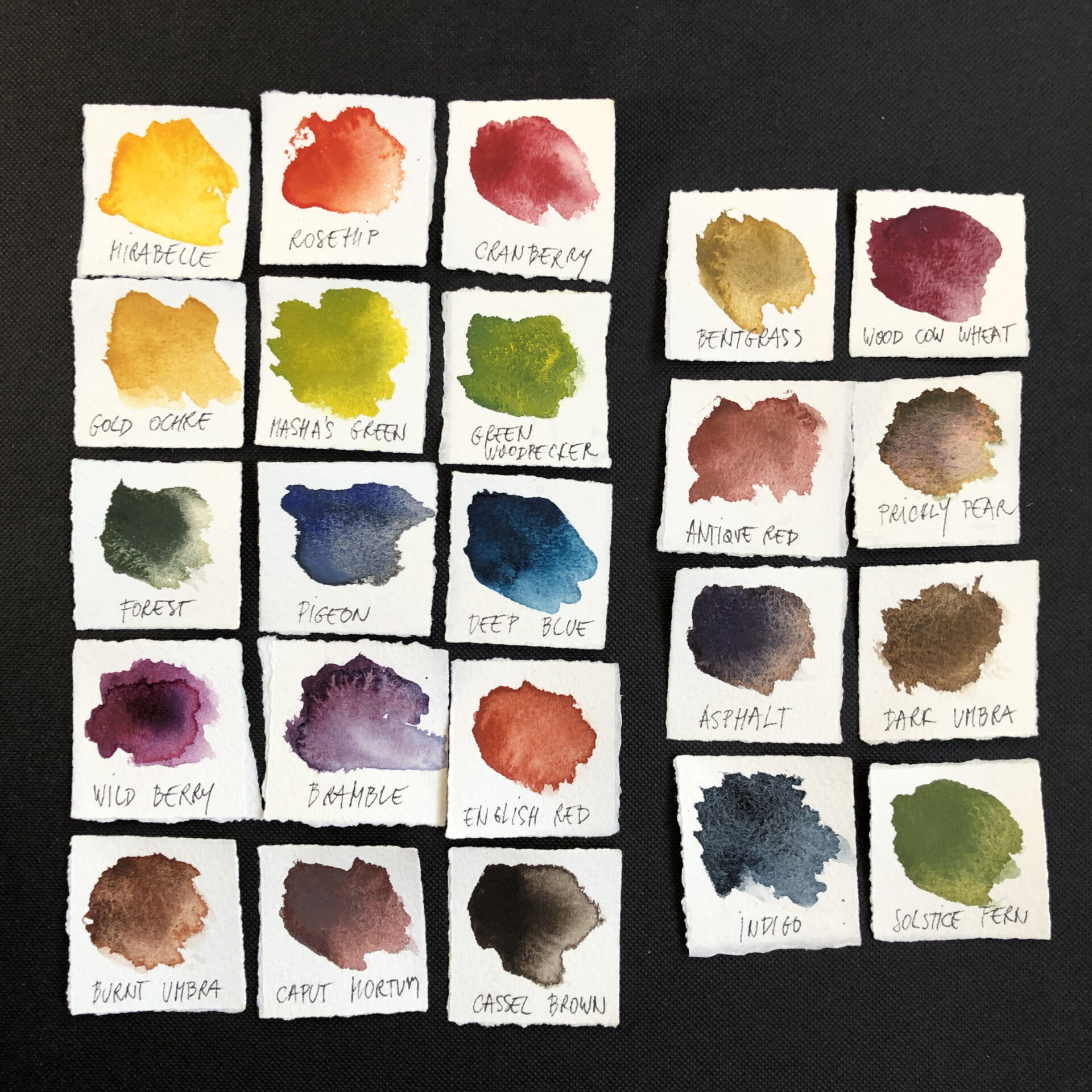
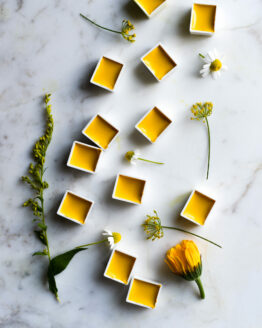
- Mirabelle: This beautifully rich yellow, is autumn’s warm, golden glow in watercolor form. A tiny amount goes a long way and imbues with a golden light whatever green, red, orange, or earth it touches.
- Rosehip: So perfectly named. But not only does it resemble the color of the early autumn rose hip seed pod, it’s also a perfect color for certain autumnal tree leaves and shrubs.
- Cranberry: A mid to cool leaning red. Juicy enough to compliment the violets and the oranges and to be mixed with the blues for even more violet mixes, but quiet enough to not dominate the whole, as some reds do.
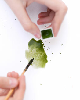
- Masha’s Green: If Mirabelle is autumn’s golden glow, then Masha’s Green can without a doubt be called chlorophyll’s luminance. The perfect hue to portray the vibrant, almost luminous tints of autumn’s shifting greens.
- Woodpecker Green: I’ve fallen in love with this green, its warm, velvety, mossy qualities and its opaqueness make it so versatile. Diluted, it is great for autumnal foliage, stems, and leaves, and applied full strength it can compliment browns and grays and add mossy-like pops of autumnal color to barks and rocks.
- Forest Green: The color of the autumnal haunted forest, shrouded in an evening fog. Moody and mysterious, it invites you in, not with the power of color saturation, but by evoking mystery and eeriness.
- Pigeon Blue: The more secretive and esoteric sibling, to that beautiful hue known as dove blue. With its delicate, violet undertones, it reminds me of the color that our beloved Mediterranean Sea takes on an overcast, autumn, late afternoon.
- Deep Blue: The other side of blue. Not moody and warm, but brighter and cooler, a must in a palette that can facilitate mixing one’s colors. Makes the whole palette so much more versatile by being in it. And it is a beautiful hue!
- Wild Berry: Rich, juicy, delicious, a lovely color to portray autumn’s berry harvest.
- Bramble: For dramatic autumn shadows and it also compliments Wild Berry beautifully.
- Gold Ocher: A favorite with my viewers. Most say that an autumn palette could not be without it and I agree!
- English Red: It was so difficult to choose between Burnt Sienna and English Red for this spot in the palette…But, eventually English Red won because it personally reminds me of the color of the forest floor near my house, which in autumn is blanketed in fallen, reddish brown pine needles. Its reddish, terracotta hue, is also a lovely addition to nature’s autumn leaf palette.
- Caput Mortuum: The color of rain saturated earth… looking at this color, it’s almost as though you can smell the scent of rain in the air. Compliments beautifully the other darker browns in the palette.
- And finally Burnt Umbra and Cassell Brown: The first, warm and deliciously chocolaty and complex, the second, a baritone color, cooler, much more opaque, and deeply earthy. They complete the autumn harmony, this whole palette sings together.
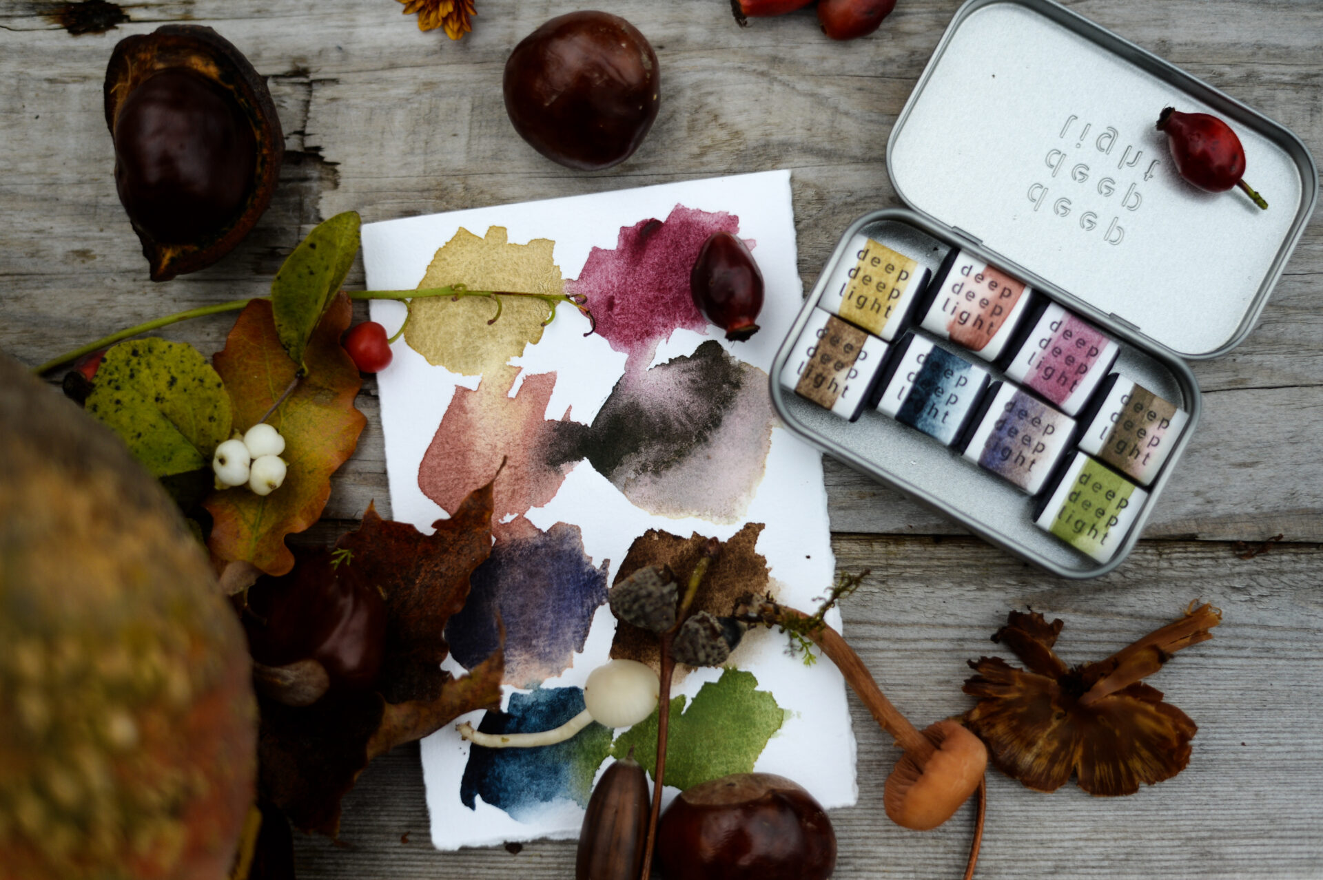
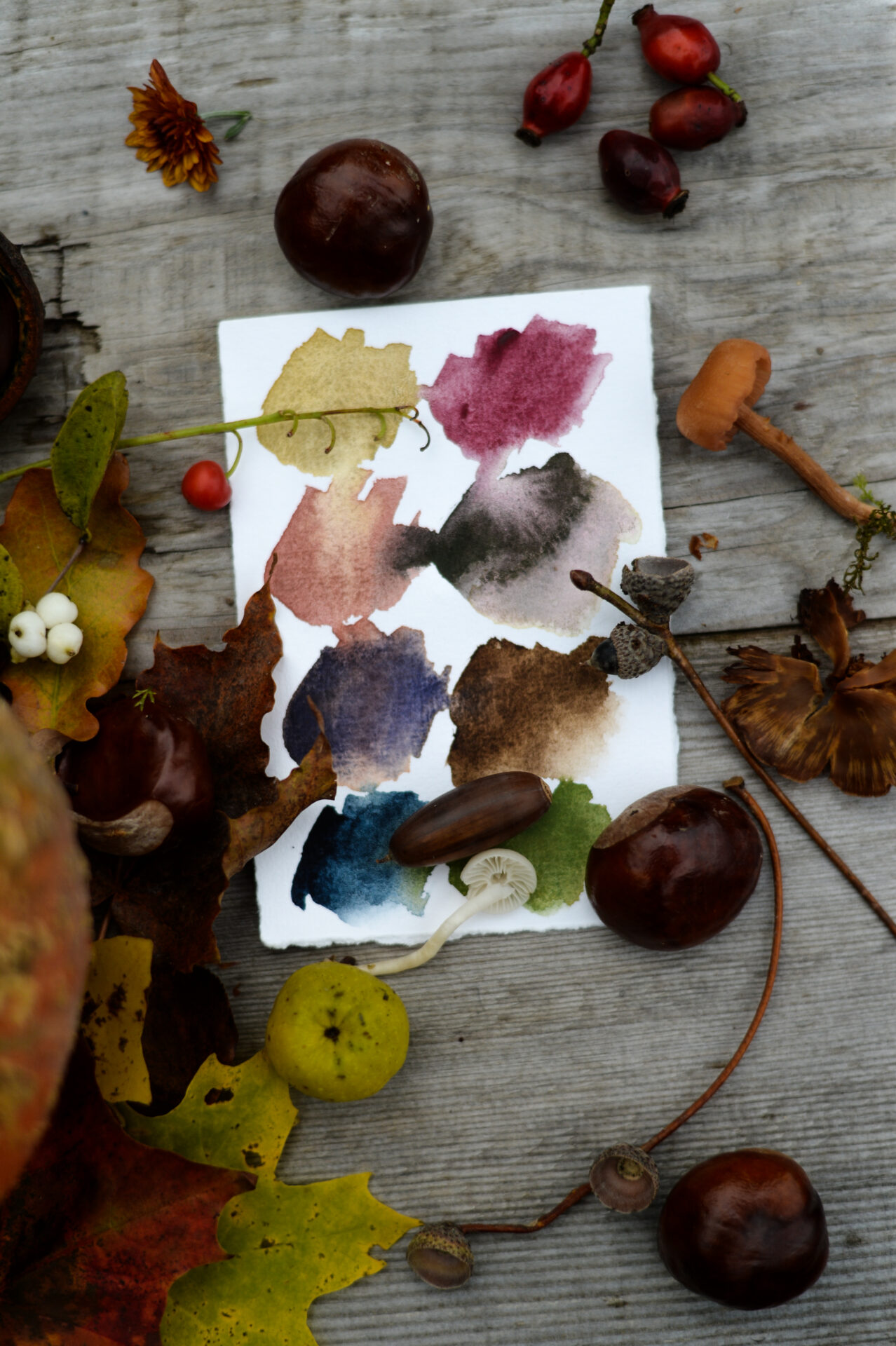
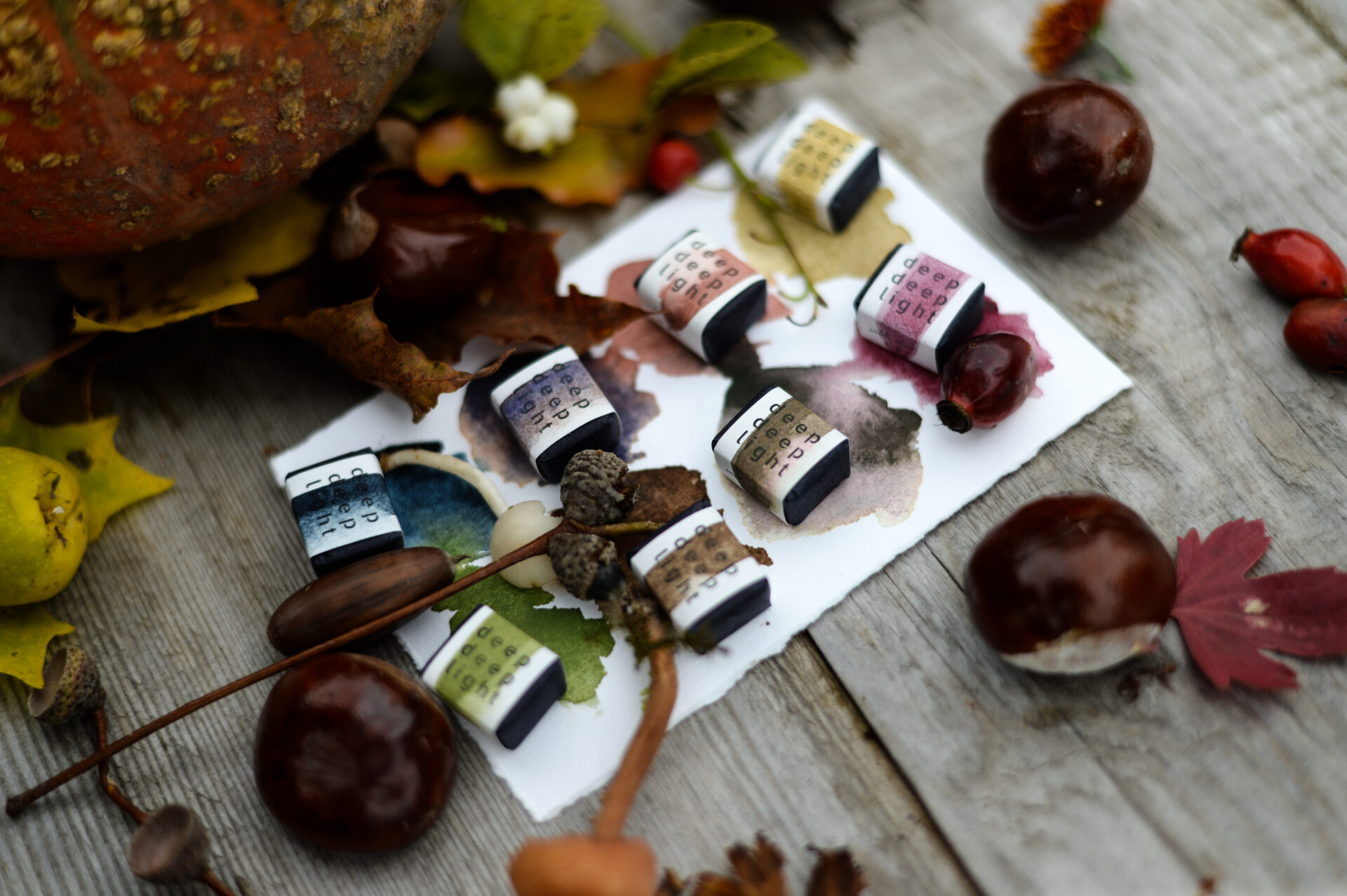
This little palette of eight colors (in a tin with a hinged lid), is a tribute to that quiet season and all its somber beauty…
- Ancient Red: Earthy, delicate, and fragile, the color leaves take a breath before they surrender to the earth.
- Wood Cow Wheat: A rich, berry hue, ripened and sweet, staining the hands of the forager.
- Indigo: Heavy, cloud laden skies, eerie and mesmerizing, hanging low over the horizon (please let us know if you have a preference for one of our indigos)
- Solstice fern: Beneath the decaying leaves, a burst of mossy color can be glimpsed, a reminder that the old will birth the new.
- Bentgrass: Spiky thistles and dried grasses, dancing in the cold breeze against a backdrop of muted browns and woody greens
- Prickly Pear: The queen of the whispered season, separating into a rainbow of this season’s colors when diluted.
- Dark Umbra: The color of damp rough bark and umber rich earth
- Asphalt: A complex dark violet grey, the color of distant hills and of the shadows that loom between the trees…
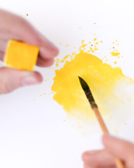
Mixes nicely with other natural and human-made pigments. For best performance add a few drops of water some minutes before starting to work with it. It will reactivate the pigment and will be more fluid.
All our watercolors are handmade from pigment or pigment mixes, binders, and essential oils as conservative. The binder is made by ourselves from gum arabic, natural honey or glycerine, and water. Our watercolors have a flowery scent, with lemongrass as the top note and sandalwood as the base note
